
We found there was a lack of a digital space where local artists could showcase their work affordably, without compromising on essential e-commerce functionality like dynamic pricing, cart management, and user-friendly navigation.
To create a space where vendors could leave a lasting impression on it's consumers (much like a sticker), my approach focused on three main areas:
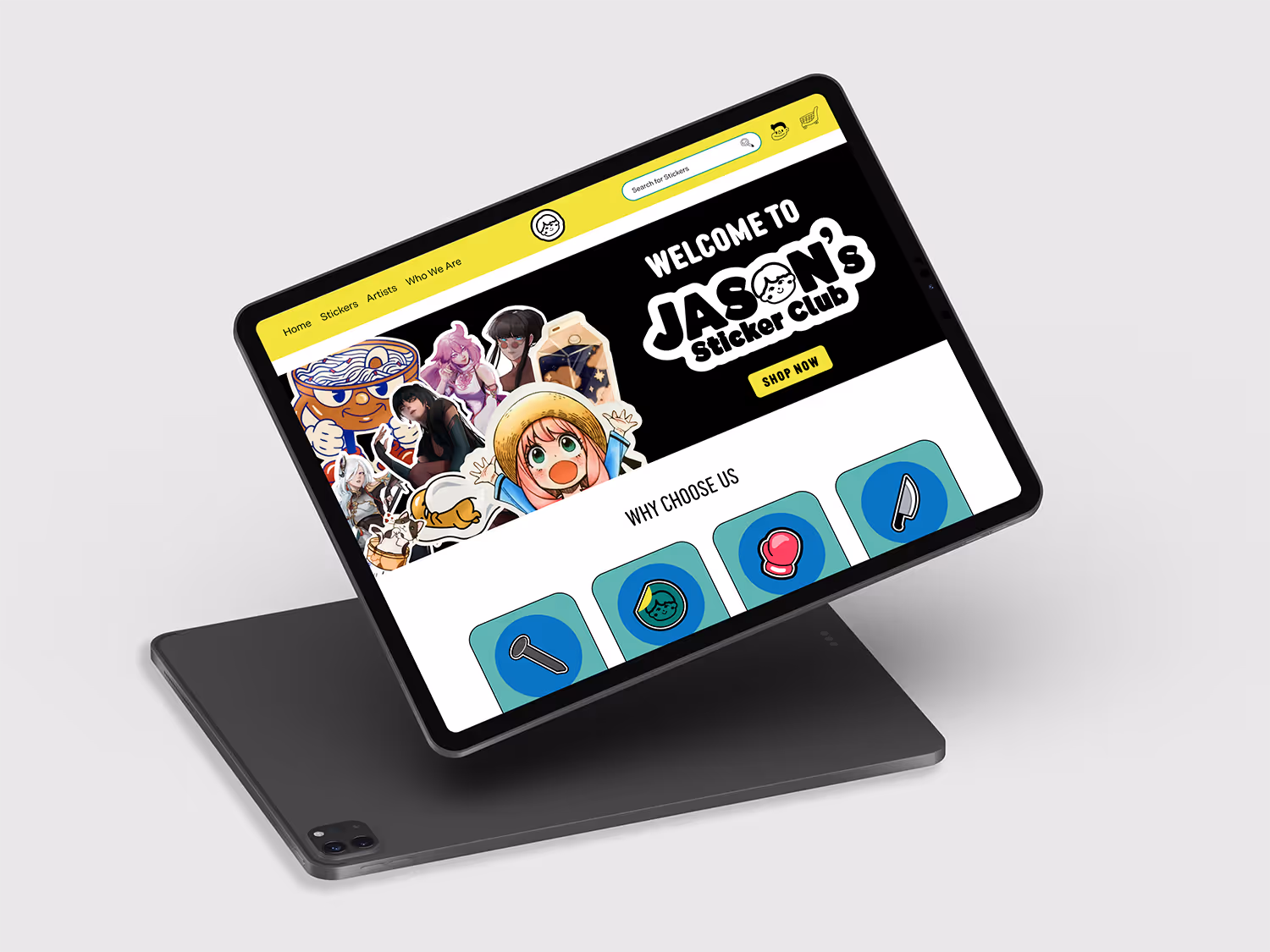
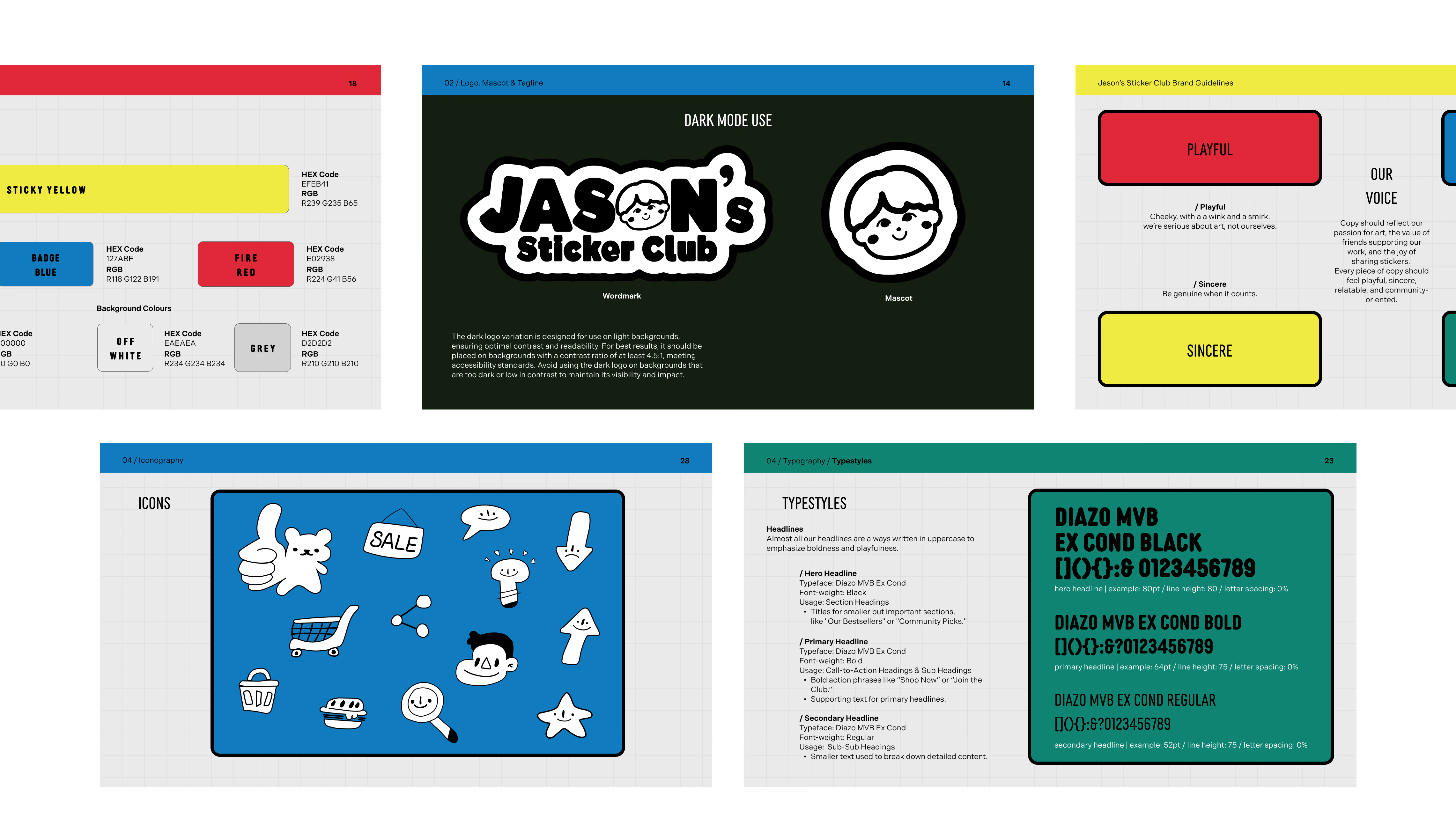
Aiming to create a platform that felt expressive and community-driven while still being intuitive and easy to use. So the team needed to design a visual language that captured the playful nature of stickers without compromising clarity, navigation, or overall usability felt like a need.
We had to address key pain points like discoverability, simple navigation, and maintaining essential e-commerce functionality without adding complexity. So an affordable, accessible space for local artists while ensuring a seamless shopping experience for users was key.
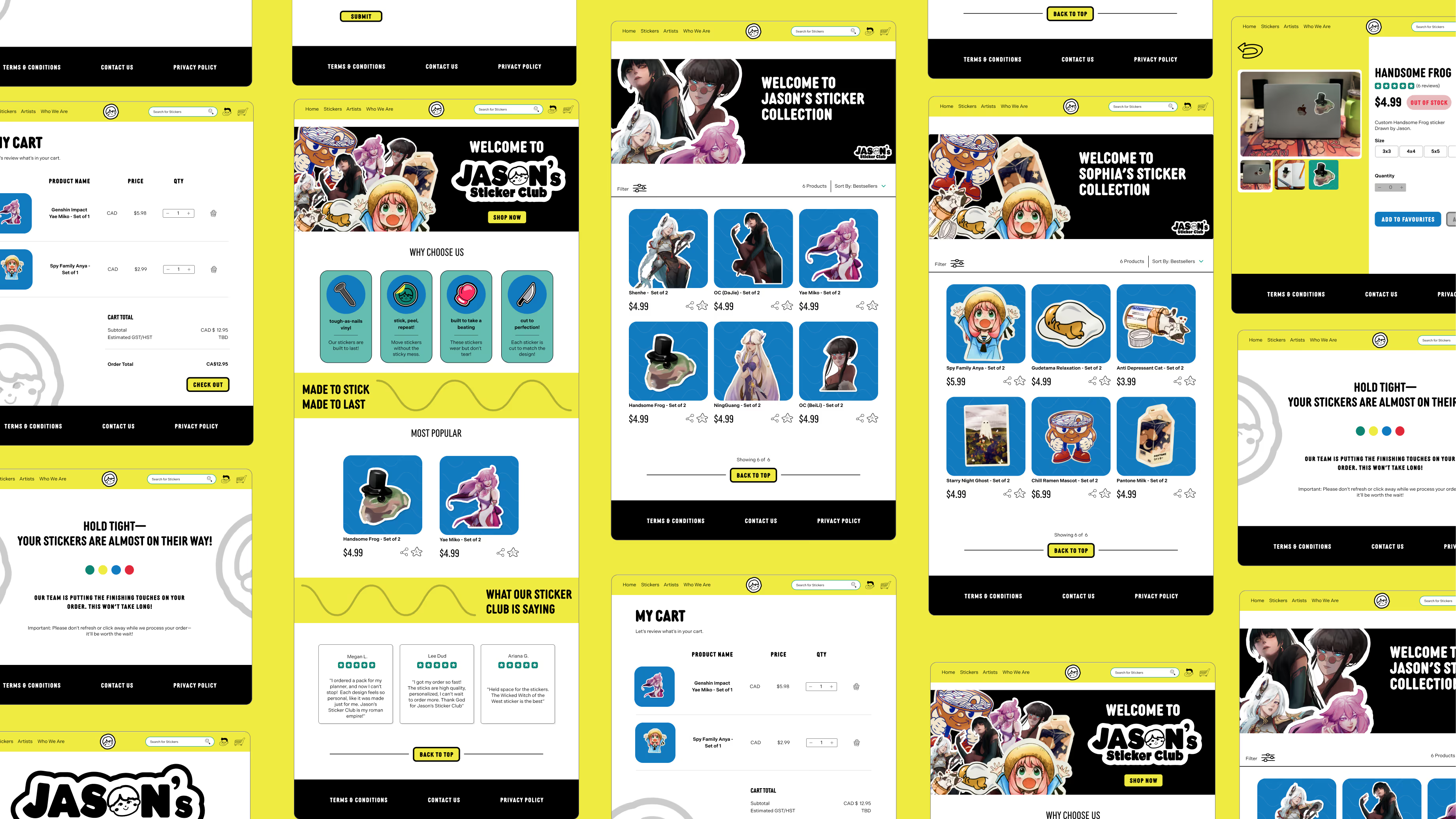
By testing key user flows and iterating on feedback we decided that refining navigational flows and user feedback mechanisms to create a smooth browsing and checkout experiences were major design goals.


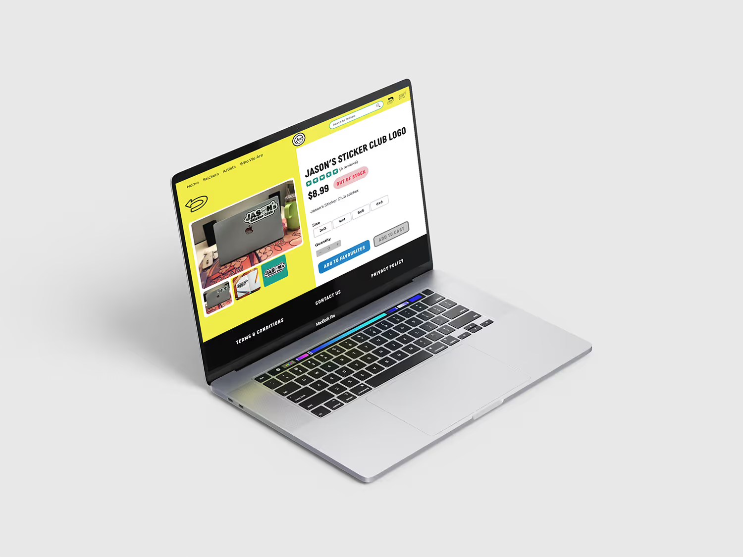
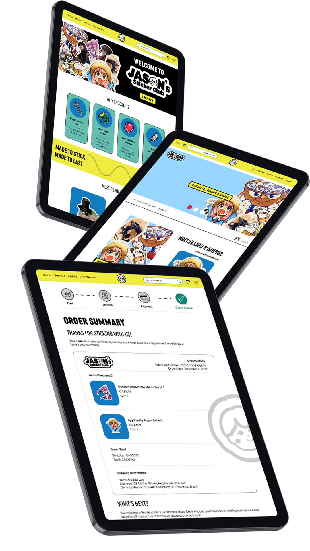
The streamlined checkout process aim to improve conversion rates by making purchasing quick and frictionless. Clear navigation and simplified steps enhanced the overall experience, while a strong design system ensured consistency and scalability.

Browsing never felt easier and made it easy for users to discover and explore stickers. Features like peer recommendations, artist profiles, and community elements encourage repeat visits and deeper interaction.

UNDERSTANDING COMPONENT STRUCTURE
Advanced prototyping requires a strong understanding of interaction design and component structure. Every interaction must be carefully mapped to ensure consistency withing the design process.
TEAM COMMUNICATION
Regular communication kept the team aligned and decisions efficient. Check-ins and team feedback helped streamline design decisions.
ECOMMERCE FLOWS
Ecommerce flows seem simple at first but are highly detailed behind the scenes. Elements like cart logic, pricing, taxes, and shipping all require careful design planning and interaction mapping.